So with my new job at Digimarc, you have surely noticed that I haven’t been writing new posts! However, I’m learning a lot and decided that it’s time to give something back. I’ll start with the image processing basics that I’ve acquired. This post is about a common way that still images are represented by computers: rasterized.
Vector vs. Rasterized images
There are two basic types of still images commonly used today: vector and rasterized images. This post is about raster or rasterized images.
Raster images are basically made of contiguous blocks of colors. These blocks are called picture elements, or “pixels” for short. Pixels in an image are usually considered to be square-shaped. They are usually arranged in uniform columns and rows. Thus, a picture is a bit like a wall of square legos.
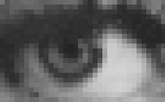
When the pixels are sufficiently small, or when they are viewed from sufficiently far away, our human visual system cannot distinguish individual pixels and they blend together into what appears to be a smooth, continuous image.

By using colored blocks and a sufficient number of pixels, raster images can represent complex imagery such as people, nature, drawn art, and more. In fact, you are probably already familiar with the versatility of raster images – all modern digital photography produces raster images!
We can better understand the details of raster graphics by ignoring color for the moment and considering black & white, or grayscale, images.
Grayscale
In a grayscale image, each pixel is composed of a single number that represents the amount of black (or white) that appears in that pixel. The number is sometimes referred to as the intensity, and it can be helpful to think of the intensity as a percentage between 0% and 100%.

The image above is a zoomed-in view of a image that’s 3 pixels high and 3 pixels wide. This is typically referred to as a 3×3 image (width x height). In this image, all the pixels are either black or white – none are gray.
One way to think of this image is white paper in a dark room. We can illuminate each pixel with white light. Dim white illumination on a pixel would turn it gray. Bright white illumination on the pixel would turn it white. We can quantify the brightness of the illumination as the intensity, where 0% = no light and 100% = bright white light.
This scheme, where increasing intensity produces lighter colors, is known as additive. The image below has been annotated with the additive intensities for each pixel.
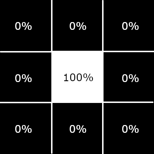
Though many interesting images can be created using only black and white pixels that are uniformly square and located on a uniform grid, more realistic detail can be represented when shades of gray are allowed as well.
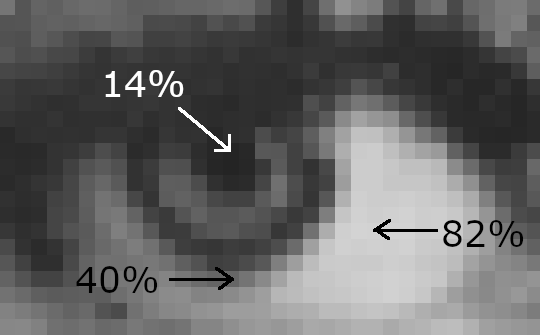
In the image of Lena’s eye above, 82% points to a near-white pixel, 14% points to a near-black pixel, and 40% points to a mid-tone pixel. So, using varying intensities of black and white between 0% and 100% allows us to clearly represent this eye, which can be discerned even when highly zoomed in.
Color
In a grayscale image, the image is made of pixels that vary in lightness between white and black. Each pixel has a single intensity: the amount of white illumination on a black pixel.
Rather than varying intensity between white and black, which produces shades of gray, we could instead vary between white and a different color. For example, varying intensity between white and red produces shades of pink.
Red-Green-Blue (RGB) images
Full color images are created by combining multiple single color images. When multiple single color images are combined into a full color image, each color is called a separation or channel. In a full color image, each pixel has multiple intensities – one for each channel. The pixel’s color is the combination of each channel’s color at that pixel.
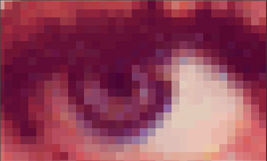
The full color eye above is composed of a red channel, green channel, and blue channel, which are shown below.
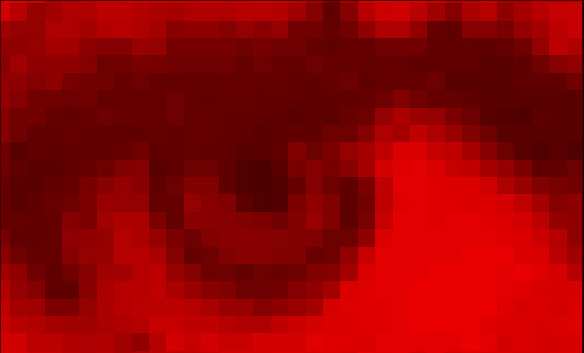
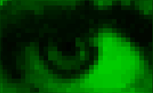
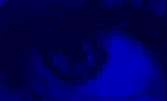
One aspect of this image that’s immediately noticeable is that each channel is relatively dark on average, yet the full color image is relatively light. That occurs because in the Red-Green-Blue (RGB) scheme, colors are additive – as intensity increases, the amount of light increases, making the image brighter.
The RGB scheme can be interpreted as the red, green, and blue components of a white light that illuminate a white paper in a dark room. For example, if the blue channel’s intensity is 0% for a pixel, it means none of the blue component of white light is illuminating that pixel. If the blue channel’s intensity is 10% for a pixel, it means a little bit of the blue component of white light is illuminating that pixel. If the blue channel’s intensity is 100% for a pixel, it means all of the blue component of white light is illuminating that pixel.
A pixel with intensities 50% red, 50% blue, and 0% green would have a purplish color. Can you think of how to create a white, gray, or yellow pixel?
This website shows how different RGB intensity percentages can create different colors. The table also includes another component, alpha, which is the transparency of the color. 0% is completely opaque, while 100% is completely transparent. Transparency allows background color to mix into the foreground color.
RGB is a common scheme to use because computer screens very commonly are manufactured to emit red, green, and blue light, which combine to create millions of colors. By using RGB data to store image data, the image data translates directly to the display: each pixel on the display just emits red, green, and blue light at the intensity stored in the image’s pixel.
Conclusion
That’s the absolute basics on raster still images! Raster images represent images by describing a uniform grid made of tiny squares called pixels. Each pixel has a color, which is described by one or more intensities.
Raster images are optimal for complex static imagery, such as photography. The pixels allow for arbitrary variation and irregular shapes, which appear throughout our natural world.
Questions? Leave a comment in the comment section below.